
Also read:
Why Email Still Matters for SMBs
Starting Your Email Marketing Campaign
The problem: Refreshing a tired email campaign
Last year, American Ratings Corporation, Nu-Design Digital’s parent company and creator of the Diamond Certified Resource, realized it had a problem. We were sending monthly emails filled with tons of great, free information to Diamond Certified Preferred Consumers, but the campaign’s performance had grown lackluster—fewer people were opening the emails or clicking the links. We knew the information was useful, but we had to think of a better way to lead readers to it.
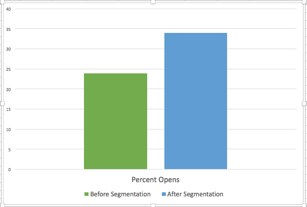
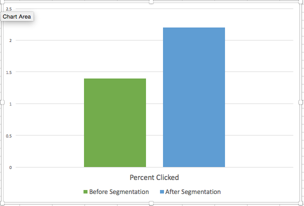
With some simple changes to the look and functionality of the email design, we improved reader engagement by a whopping 16 percent. Since engagement both builds and reflects brand loyalty, this number made us pretty happy. Today, we know more about our key audience members and are better able to meet their needs and feed their interests. More importantly, these readers have a better sense of the full range of consumer resources the Diamond Certified Resource provides. Read on to learn what we did and how you can apply it to your email marketing campaigns.
The solution: Rethink email design and make full use of campaign monitoring tools
Our email campaign needed a makeover. Just to be clear, the changes went beyond cosmetic; we also needed to reevaluate how we approached our audience. Here’s what we did to revamp the campaign:
1. We created an email design that was more up-to-date, mobile-friendly and readable.
2. We segmented our audience and created two additional email campaigns so we were in more frequent contact with our most engaged audience members.
3. We utilized A/B testing to identify specific changes that would result in improved audience response.
Email design with mobile in mind
The first step was to take a long, honest look at the Diamond Certified Resource’s current newsletter. It had great content and interesting pictures, but the design was retro—and not in a good way. The layout was too similar to a paper newsletter, and it wasn’t optimized for mobile delivery.
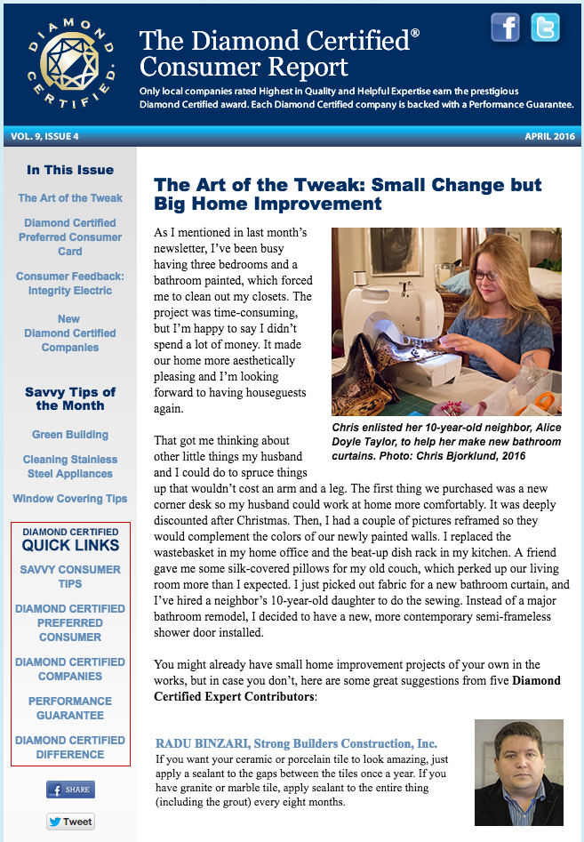
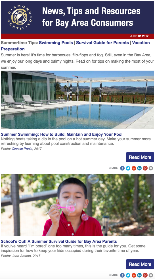
A key part of our email makeover was to take advantage of the space and functionality of the digital format. We started using wider images (about 600 pixels) to make full use of mobile screens. We also completely rethought how to incorporate links and jumped on one of the season’s hottest trends: buttons. Instead of relying on linking text, we incorporated buttons to attract the reader’s eye and oriented them to our great articles. By economizing the text, we could choose a larger font size and line height, which improved readability on both desktop and mobile.
Audience segmentation and new campaigns
Initially, we sent our newsletters to our entire email list, and the open rates and click-through rates were stagnant. We realized we needed to focus more on our most engaged audience members. We used MailChimp’s tools to identify the individuals who demonstrated a stronger interest in our newsletter. For them, we created two supplemental campaigns that took a deep dive into our consumer resources. The readers who wanted more were receiving more, and overall audience engagement quickly improved.
Pass the A/B test
Email marketing platforms make it easy to test different aspects of your campaign. We figured we could improve audience engagement if we could pinpoint the best time to deliver our messages. From the staff’s perspective, it was easiest to prepare emails for a Friday afternoon delivery, but the Diamond Certified Resource has long known that Mondays have the most web traffic.
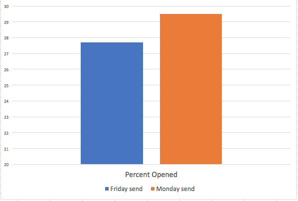
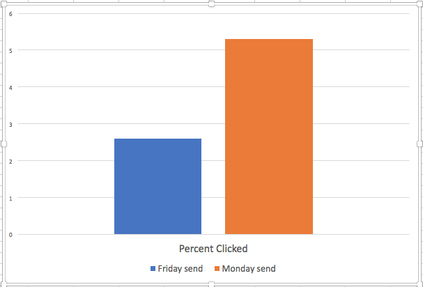
As we expected, readers were more interested in learning about consumer issues on Mondays. Going a step further, we wanted to see if altering the time of delivery would make a difference. We discovered that recipients were less likely to open an email sent out Monday morning (probably because that’s when everyone returns to work and has a full inbox) and more likely to open an email if they received it on Monday afternoon.
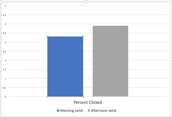
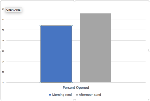
A/B testing turned out to be an easy way to learn about our audience. Moving forward, it offers us a great way to experiment with different aspects of email content, delivery and design.
Your audience is always changing—you should, too
Our email campaign makeover didn’t change the fabric of the Diamond Certified Resource’s newsletters—they continue to offer the same informative, consumer-focused materials. The changes we made were simple and helped us reach out to the readers who matter most. No email campaign template should be coded in stone; like fashion, the presentation of your message will shift over time to meet your audience’s tastes. For a successful email campaign, you don’t need to be a trendsetter, but you also don’t want to send out the digital equivalent of polyester bell-bottoms.
Photo: Dad’s First Bellbottoms, by Greg Younger, CC Image on Flickr
