We’ve been tracking results from our email campaigns over the last year and we want to share an important insight we picked up: You can plan and optimize every aspect of your email marketing strategy, but nothing beats sending great content.
Sure, everyone wants their emails to have great content, but what you think is great content and what your readers think is great content are often miles apart. That was certainly the case for us. After spending a year tinkering with subject lines, send times and other details, we eventually learned to see our newsletter from the reader’s point of view. Once we did that, things started to fall into place. I’ll go over how we identified the best content for our readers and you can apply the same techniques to re-tool your own email campaigns.
Why Did People Engage With Some Newsletters But Not Others?
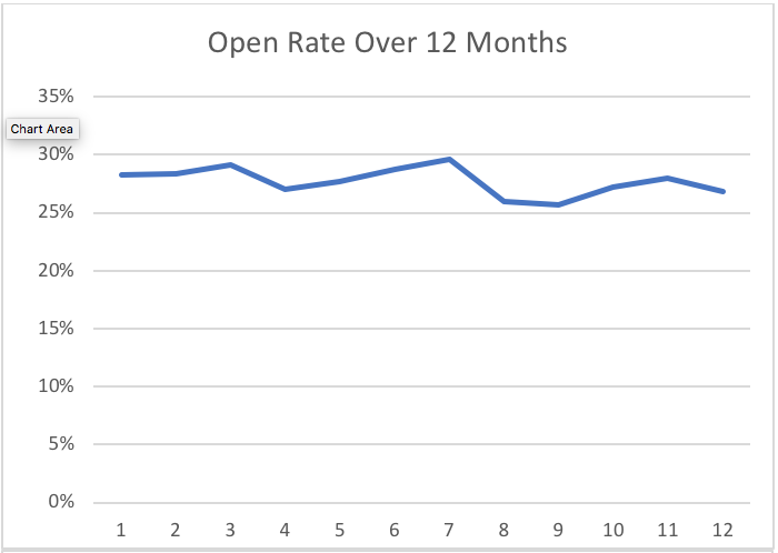
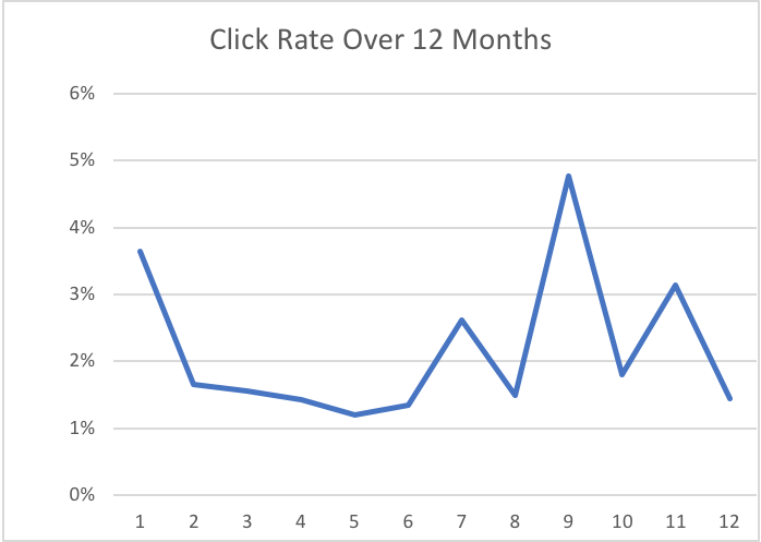
American Ratings Corporation, NationalWeb’s parent company, sends several email newsletters every month to keep in touch with our most invested audience members. The goal of these emails is to highlight all the useful information we make available to consumers for free. One of the most popular (as measured by open rate) is the Expert Tip Newsletter. This is a short email featuring video content about consumer issues, such as DIY auto repair tips or insider advice from contractors. While the open rate for the newsletter was generally consistent over 12 months, we noticed some unusual fluctuation in the number of people who clicked on the video content.


We needed to figure out why readers were clicking on some emails more than others. We thought all the newsletters were equally useful and interesting, but our readers clearly had certain preferences. To figure out what our readers wanted, we needed to re-evaluate some of our basic assumptions. That’s the first step toward improving engagement with your newsletters: Identify your assumptions about what content works and then investigate if those assumptions are really true.
First, a little background
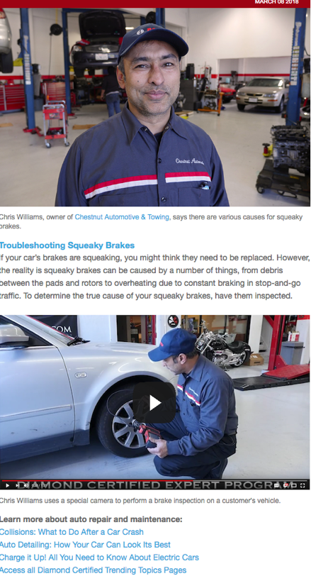
The Expert Tip Newsletter is the most concise email we send—a brief introduction, a video and some links for further reading.

The format of the newsletter doesn’t change from month to month, but the content does. To this end, we tried to keep things varied. One month, we would have a tip on auto maintenance; the next month, we’d show something about dental care. This way, we could meet our audience’s wide range of interests and simultaneously highlight the broad range of industries we represent.
How We Investigated Our Assumptions About Content
Assumption #1: The content must be timely
We assumed readers would be more interested in tips about swimming pool maintenance in the summer and gutter cleaning in the fall, but things didn’t pan out that way. For example, we sent a tip on air conditioner repair at the height of an August heatwave. Despite the timeliness of the tip, very few readers clicked on the video content. This was especially curious because the open rate was actually higher than the other newsletters we sent that summer. This wasn’t a question of people being on vacation and ignoring their email—there was something key that we weren’t giving our audience.
Finding: Timeliness did not increase clicks.
Assumption #2: People want flash-bang photos
We also assumed our readers would be more likely to click on a video link if the image was interesting or dynamic in some way. For example, we thought an image of a technician demonstrating a repair would get more clicks than an image of a person simply talking. This turned out to be true…sort of.
The Expert Tip Newsletters with the highest click rates all had dynamic images; the ones with the lowest click rates all used “talking head” style images. But we discovered a good image didn’t always lead to more engagement—three newsletters with eye-catching images failed to attract even a modest number of clicks. Using great images was part of the puzzle, but we needed to do more to give our readers what they wanted.
Finding: Flash-bang photos sometimes help, but not always.
A quick note
The examples above detail the preferences of our audience. Your audience may have a completely different response to these factors. The point is you need to question your own assumptions about email content. Does your audience really want information about products that are on sale or do they prefer information about new products? Do they like graphs showing how much their charitable contributions have helped a cause or do they prefer personal stories with photos? Every company’s audience will be unique.
How We Found a Content Solution That Worked
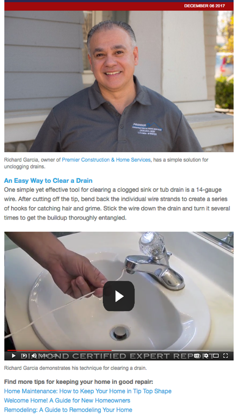
By the end of the year, we finally cracked the code. In December, we sent what would be our most-clicked newsletter, “An Easy Way to Clear a Drain.”

Even though it was December, we didn’t select a tip that would tie in with the holidays or the cool, rainy Bay Area weather. We did include a dynamic video image. The open rate for this email was slightly lower than in previous months, but the number of clicks was much higher. What made the difference was the tip itself. We identified three qualities that we believe made it irresistibly clickable:
- First, the tip addressed a common problem. Almost everyone has dealt with a clogged sink at some point.
- Second, it addressed a simple problem. Some of our other newsletters take a deep dive into the subject matter but require a technical background that most readers don’t have. With this brief email format, it makes more sense to present the reader with a bite-sized problem to solve.
- Finally, the tip promised an “easy” solution. This DIY tip doesn’t require much of an investment of time or money to fix the problem.
We offer a lot of free consumer information on our website, and the goal of our newsletters is to connect readers to those resources. Sometimes it’s tempting to show off just how much is available. We could pummel the reader with a huge range of tips or take a deep dive into any number of industries, but we got better results when we kept the newsletter content simple and practical.
What Happens Next?
When you first start an email campaign, you spend a lot of time tweaking the details, such as experimenting with subject lines and send times. We found playing around with those things was useful and could result in small but significant changes in reader engagement. But if you find that your audience still isn’t responding to your campaigns as you’d hoped, the problem likely isn’t that you’re sending them on Fridays instead of Saturdays.
With so many trackable and testable aspects of an email campaign, it’s easy to forget to take a step back and look at the campaign from the reader’s perspective. Some audiences will want detailed newsletters; some will want just the basics. Some audiences will be dazzled by graphs and photos; others will find them distracting. When you put on your marketing hat, it’s your job to cast aside your assumptions about what your audience wants to hear and listen to what your audience has to say to you.
